
For us, fabrics are much more than just a detail, they are an integral part of the design. For this reason, within the new collections we have used an exceptional textile and colour designer, Giulio Ridolfo.
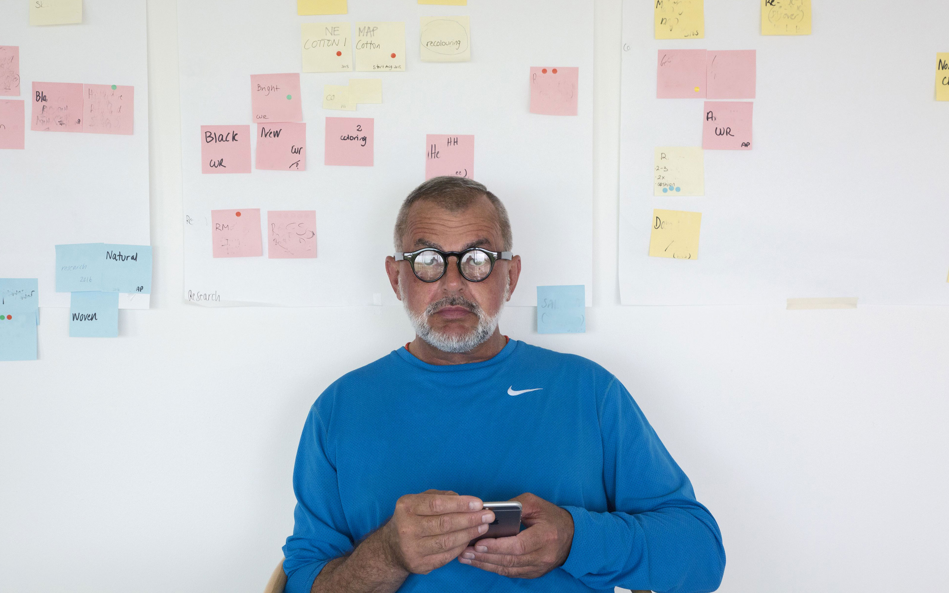
I trained several years ago, when the figure of textile and colour designer was not yet so common. I studied fashion and got a master’s degree in Fashion design, and in this field colour was (and still is) a fundamental component, linked to research on materials and in particular on fabrics. My job is to find the right fabric – as a tailor would do, with particular attention to shapes and stitching – but in the field of design supplies.
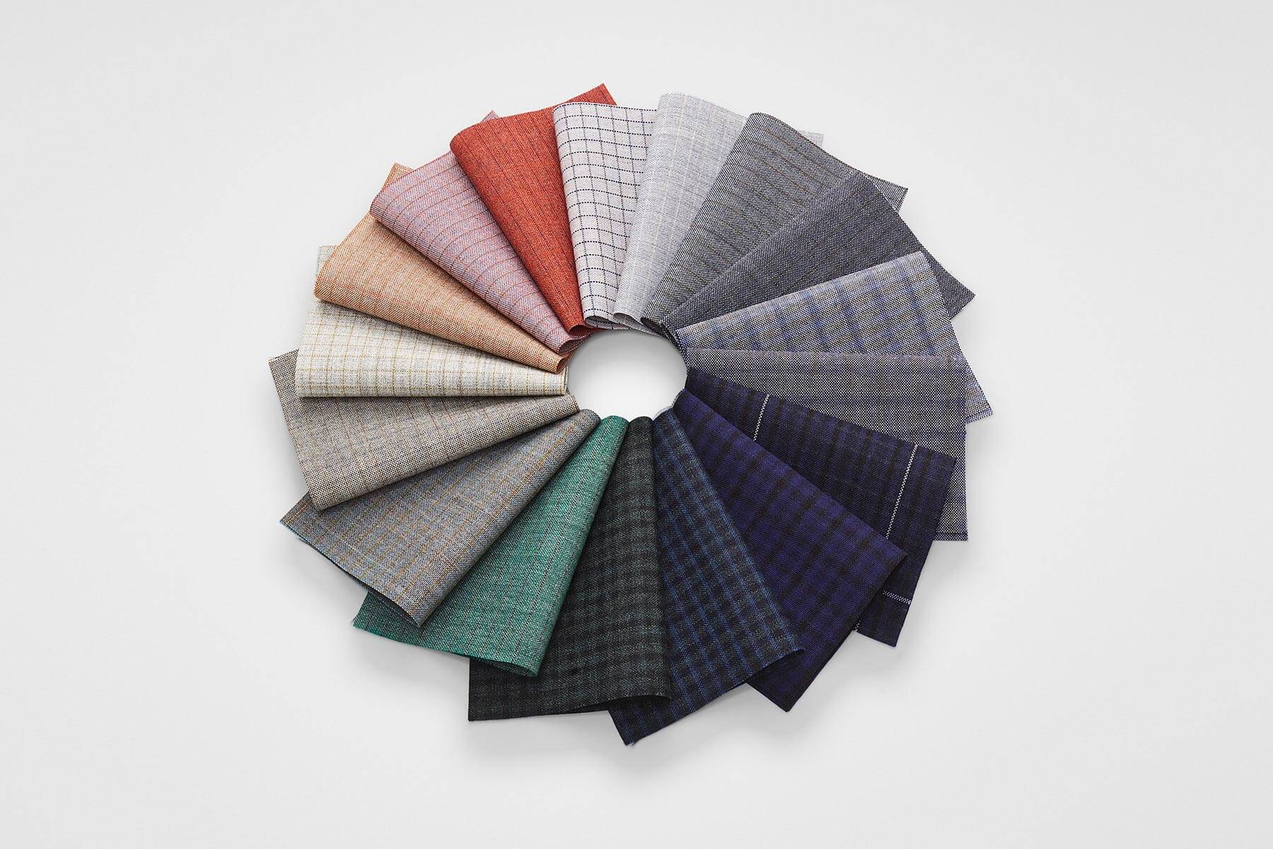
It is more than a method it is a collection: of stimuli, occasions and themes. The starting point is always a collage of archive fabrics and a layering of objects: a decomposition that helps me to imagine the story. As for colours, I work with the NCS chromatic system because with its inter-tones I create layers and veils, a pictorial work similar to the one we do with watercolours, based on subtraction rather than addition. I find that today there is an immoderate interest in colours, with trends that change from year to year: it is something that gives me to think about, because colours are a joy for everyone and should not be imposed. Certainly, some colours within trends and styles are in the air.
 Prev
Prev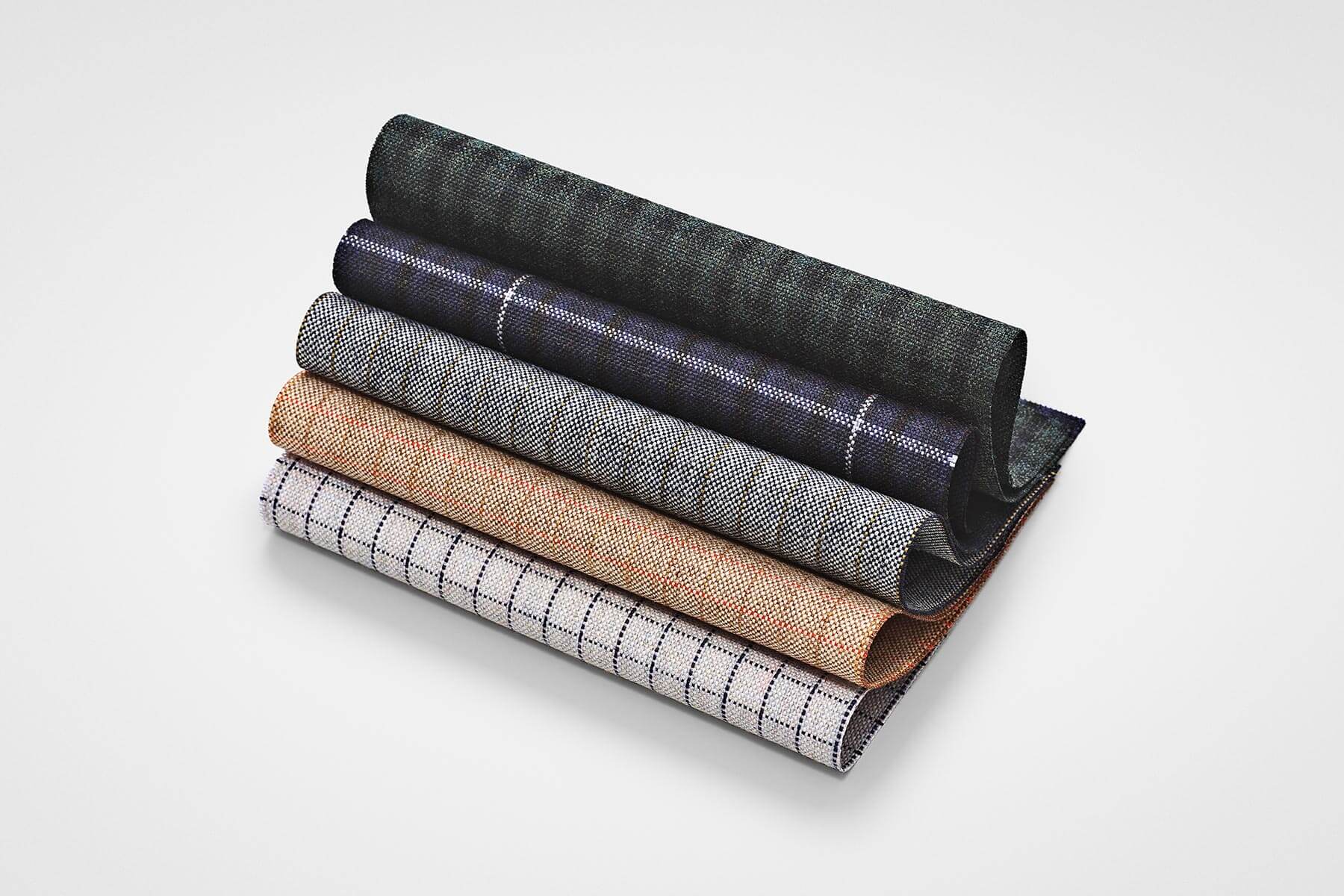 Prev
PrevI love both of them very much. For a long time, I only expressed myself through fashion, it’s a world I like for its creativity but not for its compulsive rhythms. When I found myself working for the furniture industry, almost as a game, I felt more comfortable in its long time periods and in the possibility to reflect calmly.
Cantarutti asked me to collaborate on the colours of the fabrics for their full collection of chairs. I was struck by their understanding of colour as a continuous value and not linked to a periodicity or a trend.
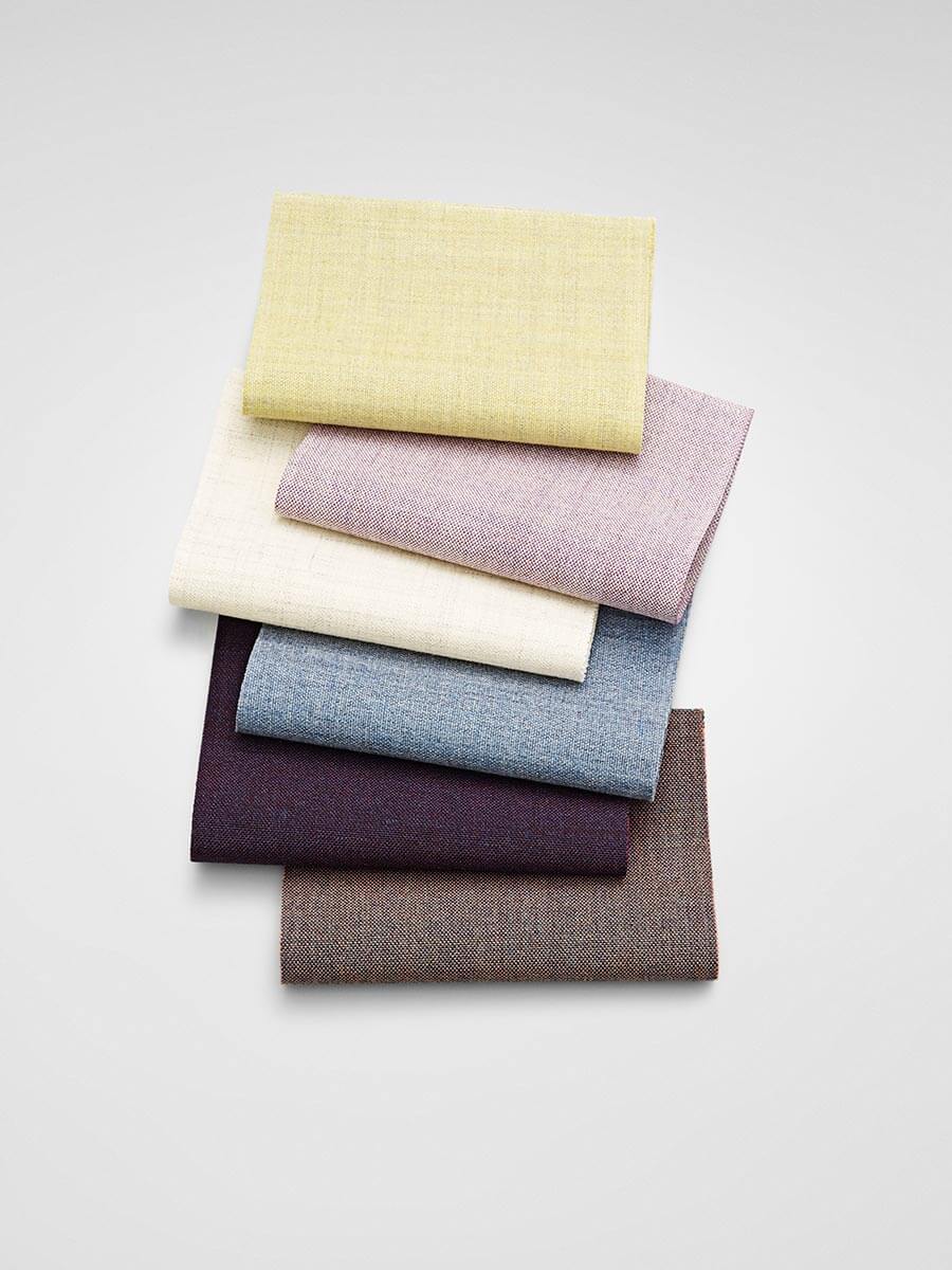
Cantarutti is a company where wood is an archetype. Beech and Ash are the starting point, both grains are light colours that needed to be enhanced, made bright. This is what the Mediterranean is all about: light, vibration, openness and joy. It was very interesting to put it to work on the projects of Nordic designers or at least with a marked sign, where the colour had to harmonise not only with the grain of the wood but also with witty forms, in a blend that was harmonious and sensual.
 Prev
Prev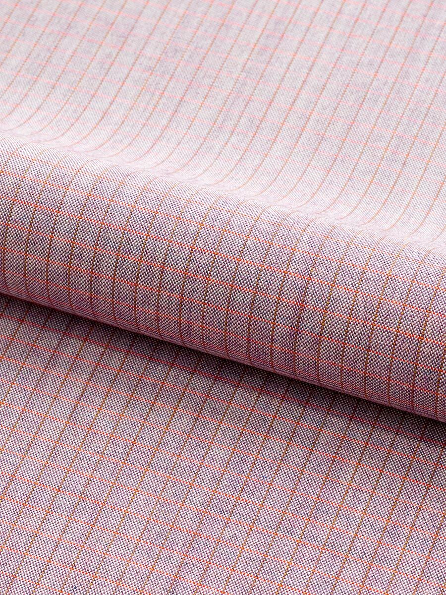 Prev
Prev